J2me or Java Me or whatever it is called has a high level and low level user interface API
The high level UI API is quite simple and allows you to create forms and add fields and lists; check boxes, radio buttons and soft key commands; event handling etc etc.
This is all dandy but its not very nice to look at and varies quite considerably from device to device. Fonts will change and soft keys will (as if by magic) jump from button to button depending on the whims of who put the jvm together for the phone. Midp2 improves this a little but not much,.
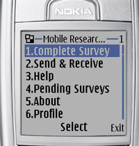
What you get is stuff that looks likes this.

The only alternative to this is to develop you own custom interface in the low level api. This is low level in that you are writing you own paint() routines and drawing text on the screen and doing the word wrapping your self etc. This is ok for Johnny Game developers, but is just plain bleedin awful for the rest of us.
To get round this you can use the UI features of j2me Polish. This is a tools suite that is a big help in developing j2me applications. Using the UI libraries of j2mepolish and the preprocessor directives you are able to continue to create midlets using the simple high level but translate them into purdy looking applications by running the source thru the j2mepolish preprocessor.
For instance to create a list in the high level api I would use the following code.
List list = new List("Mobile Researcher" mTitle, javax.microedition.lcdui.List.IMPLICIT);

list.this.append(menuItem1, null ) ;
list.append(menuItem2, null ) ;
list.append(menuItem3, null ) ;
This would produce a midlet looking something like this.

To pretty it up with Polish I would create a polish.css file and fill it full of familiar css code like this:
.menuUI {


 background-color: lightblue;
 focused-style: menuUIFocused ;

}

.menuUIItem {
 margin-left: 10 ;
 margin-right: 10 ;
 margin-top: 4 ;

 font-face: proportional;
 font-size: small;
 font-color: black;
 padding: 4 ;
 background-color: white;
 layout: left | horizontal-expand;
 border-color: black;
 border-width: 1 ;

}

.menuUIFocused extends .menuUIItem{

 background-color: rgb(49,106,197) ;
 font-color: white;
 font-style: bold;
}
Then I would add some preprocessor directives above the high level ui statements like so:
//#style menuUI
List list = new List("Mobile Researcher" mTitle, javax.microedition.lcdui.List.IMPLICIT);
//#style menuUIItem
list.append(menuItem1, null ) ;
//#style menuUIItem
list.append(menuItem2, null ) ;
//#style menuUIItem
list.append(menuItem3, null ) ;
Then run it throught the preprocessor and out pops a list that looks like this:

What polish is doing is just preprocessing the code so that rather than using the regular high level ui it using the groovy polish ui which of course has all been painstakingly created in the low level ui, thankfully by someone else.
Phew.
This is lot nicer and demonstrates only a small portion of the tools provided by j2me polish.
This is only a small bit of what polish can do. More later.


